Corpen Rebrand
Creative Brief: Refresh the brand identity for Corpen Real Estate Group a company that aims to embody honesty, integrity, and results in the California real estate market.
Role: Brand Designer
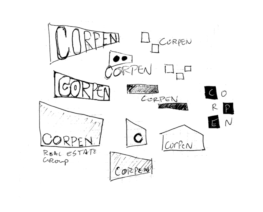
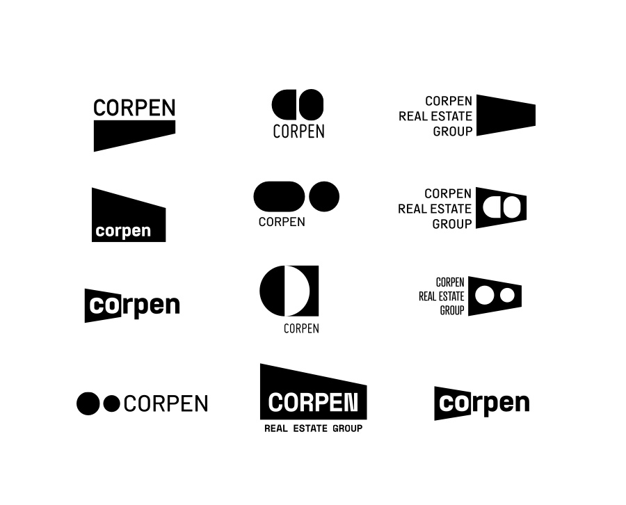
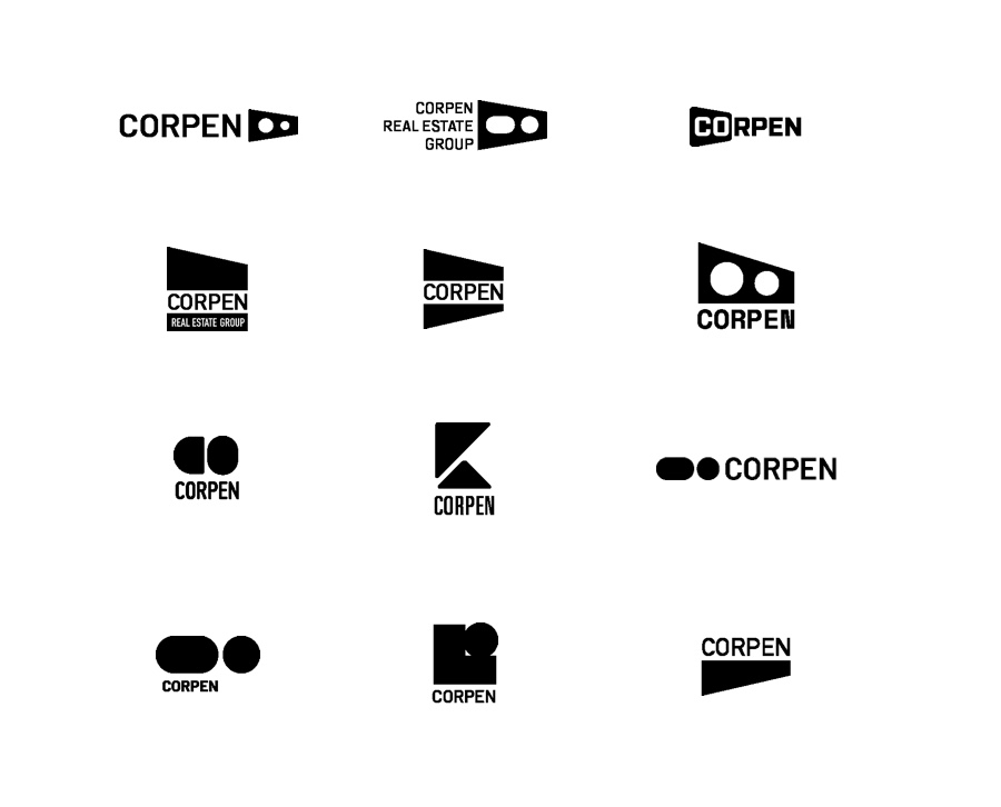
Process: This project started with a round of discovery where I gathered information about Corpen, its background, and its core ethos. Next, I distilled the brand pillars into sketches and concepts. Lastly, I developed a series of revises to tweak direction into the final identity.
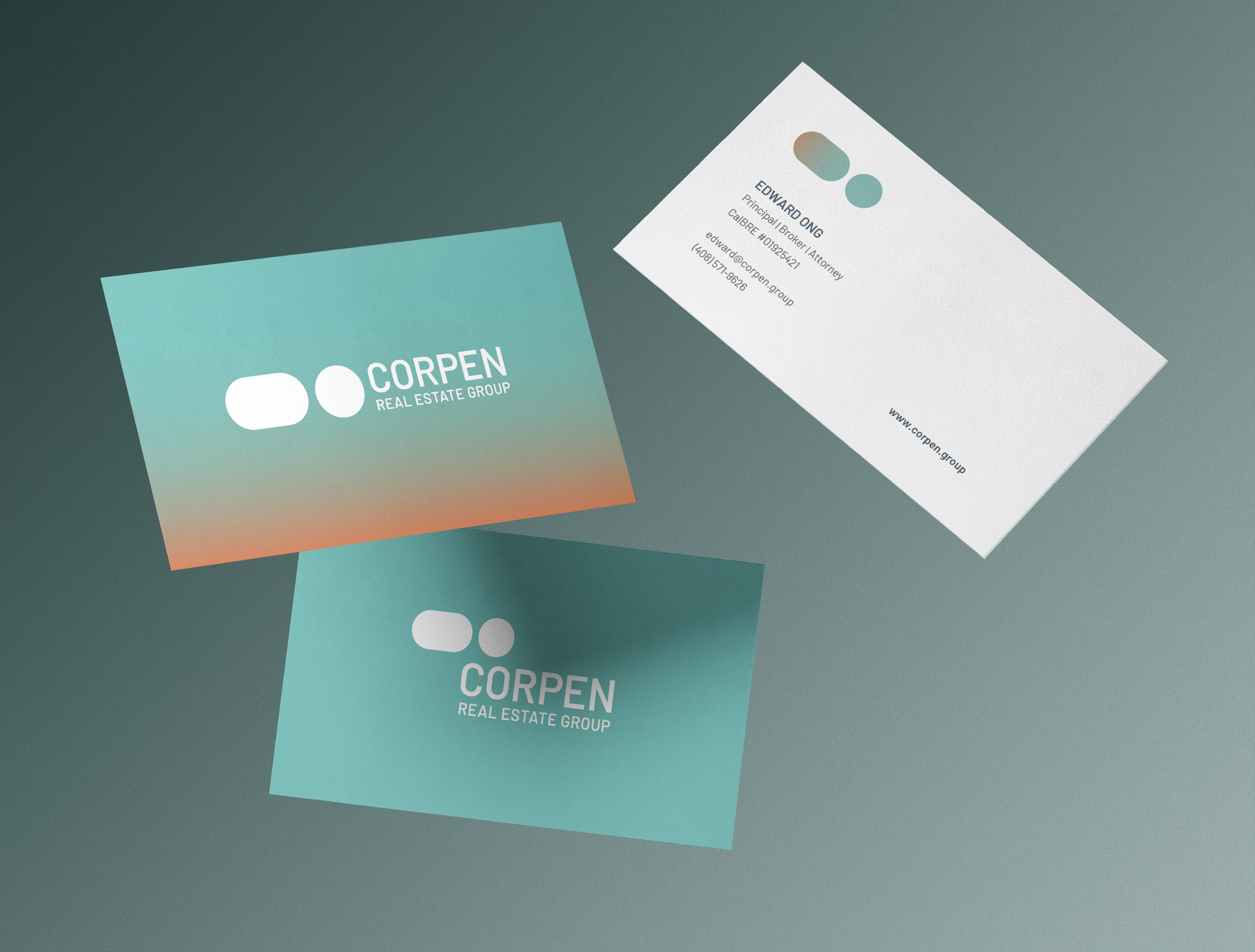
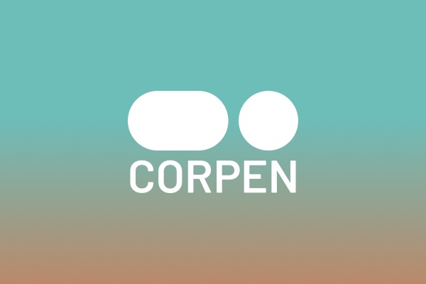
The logomark was inspired by the naval corpen flag, a tool for accurate communication at sea. The logotype is set in Barlow, a versatile sans-serif typeface that is both modern and approachable, reflecting the brand pillars.
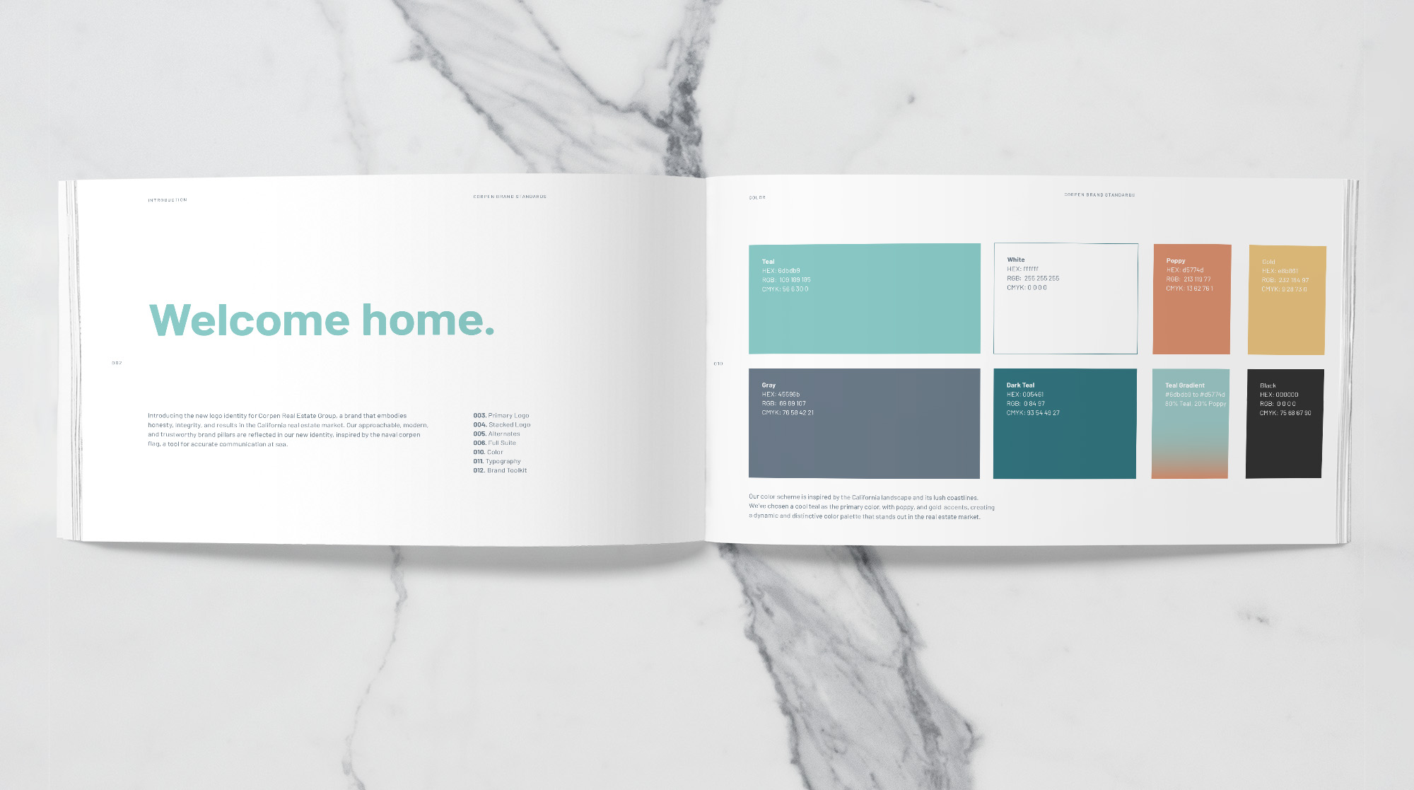
The color scheme is inspired by the california landscape and its lush coastlines. I kept the cool teal as the primary color, with poppy, and gold accents, creating a dynamic and distinctive color palette that stands out in the real estate market.